In this post we’re going to look at 6 of the best school websites – but more specifically what makes them outstanding.
In fact, if you are thinking of redesigning your own school website, then utilising these same techniques will ensure that your new school website will be extremely user-friendly on both desktop computers and mobile devices, and as a result convert more visitors into open day visitors and admissions enquiries.
With more and more parents first checking out school websites from their phones – making your school website easy to use on mobile is critical.
So, let’s get started looking at 6 examples of the best school websites and what makes them brilliant.
* We have to admit websites marked with an asterisk are school websites that we’ve created.
Let’s do this!
1. Kew Green Prep School Website *

Kew Green Prep is a co-educational school in London, for children aged between 2 and 11 years of age. And yep, we’re starting with a school website design that we created!
Kew Green Prep contacted us as their previous website was very generic and template like, lacking in character and personality. The school needed something 100% unique to them, their brand and importantly, a new website which was going to be extremely easy to update.
We achieved all this by creating a fully bespoke website design and then custom coding it on WordPress, giving Kew Green Prep’s marketing team full control of all content, images and even the freedom to build their own pages from a selection of modular elements.
Visit This Website
What makes the Kew Green Prep school website design great?
So what makes it great? Here are a few things we love about this school website:
Immediate character and uniqueness
This school website was designed from the ground up to be completely unique to Kew Green Prep. This allowed us to take their brand guidelines and produce a look and feel that ticks all the boxes for them.
We utilised diagonal masks on images to inject some character and uniqueness, which combined with engaging photography of their pupils, shows the real spirit of this school.
As you scroll down the page various sections of content fade and animate into view, encouraging visitors to continue scrolling and exploring down the page.

Clear calls to action
As with all school websites, the name of the game is generating admissions and open day interest, so with the Kew Green Prep site, we were sure to include clear calls to action to direct people through to these pages from the homepage and internal pages
This is something you absolutely must do on any school website.

Fully featured news section
Kew Green Prep’s news section allows them to feature and pin 6 or more articles to the top of the page and then lists out further articles in chronological order as you’d expect.
This approach helps them keep this section fresh and interesting, especially as each article can be accompanied by a featured image.
As these news articles can become entry points into the site from users conducting Google searches, the individual news article page includes an “Admissions” call to action, designed to encourage visitors to take action.
This leads us nicely into the next section…

Sticky Sidebars
On Desktop devices you’ll notice that all the internal pages on this site have sidebars that stick to the top of the page as you scroll. This ensures that they’re always visible, no matter the length of the adjacent content.
We implemented this technique to make sure that on a Desktop device the sub navigation and call to actions are always visible, so parents don’t have to scroll back up to the top of the page to see them.
Try doing this on your own website and you’ll see an increase in conversions.

High accessibility, SEO & best practice scores
Another reason we think the Kew Green Prep School website stands out is its accessibility, best practice and search engine optimisation (SEO) scores (source Google),
With every school website we create, we ensure that search engine optimisation is high on the agenda from day one of the project, not just when we’re actually coding up the site.
This means we’re able to include all the on-page SEO elements Google likes to see when ranking pages, and then when it comes to coding the website, best practices can be implemented to ensure good load times and really high SEO scores as shown above.

2. Cheam School Website

Cheam is a contemporary school based on the Berkshire / Hampshire border. We absolutely love this site, so hats off to the school web design agency who created it.
What makes the Cheam school website design great?
Let’s delve in and see what makes the Cheam school website great.
Beautiful clean design
This is no doubt a beautifully clean website that utilises lovely typefaces and white space to achieve an overall elegant and modern look.
We love the use of dropcaps and two columns used to display the content as your scroll down the homepage, as well as the use of mis-aligned image and content blocks in the “Stay up to date” section.

If you click the navigation items you’re presented with a dropdown menu. This shows the pages within each section in a clear way, as well as highlighting one area visually with a featured image and text block.
This is a really nice way to draw attention to important areas within each section, so if you’re school website requires a large number of pages, you consider implementing a similar technique.

Obvious admissions process
The Admissions process on the Cheam School website uses a custom layout, making it obvious the steps parents need to follow in order to apply.
We’d recommend doing this so parents know exactly what to expect after they’ve submitted your admissions form.

3. Maida Vale School Website

Maida Vale School in London is another of our school website projects. They contacted us in the summer of 2024 to create a refreshed, bespoke website that would give their marketing team complete control over every aspect.
We took the school’s brand guidelines and custom designed an immersive, modern school website that has been very well received by visitors and parents and has helped increase admissions.
What makes the Maida Vale school website design great?
So let’s take a look at what works well on this website…
Introductory sequence
When the Maida Vale site loads for the first time, you’ll see a short animated introductory sequence that sets the tone. It allows the school to get across their USP, which then fades out to reveal the homepage.
This is a nice technique that quite a few schools employ nowadays, so if you’ve got a clear message or set of values, this kind of intro sequence can be a great way to get this across to prospective parents and students.

This school website shows a hamburger menu icon which reveals the navigation options when clicked on. Because the site has many sub-pages, this approach works really well on both Desktop and Mobile devices.

Great signposting
One thing we know from building and analysing many of our client websites, is that visitors need clear directions. That means that your website needs to do a great job of pointing your visitors to the next place that might be of interest for them.
We do this on the Maida Vale School website with the inclusion of a “Why not explore” section at the bottom of all sub pages. This provides the visitor with relevant options they can go on to explore, therefore keeping them engaged and browsing the website for longer.

Subject pages that accommodate different content types
On the individual subject pages (like this Science page), as well as displaying all the necessary text content, we created the ability for Maida Vale to also display additional ‘enrichment’ content.
This can take the form of image galleries and news posts that relate to that particular subject too.
We’d recommend doing something like this if you can to help show parents the extra curricular activities that take place around each subject area.

4. Port Regis School Website

Port Regis is an independent school based in Shaftesbury, Dorset. Their lovely website does a lot of things really well, and we aren’t scared to give a cheeky hat tip to the agency that created it.
What makes this school website great?
From the general design, typography and animations, there’s a lot of great stuff on the Port Regis site, so let’s get into it…
Immersive homepage video
We’re always fans of video and we love how you see a full screen video as soon as you land on the homepage of the Port Regis website. The danger with these background videos can sometimes be that users don’t scroll down the page (more on that later), but the Port Regis site avoids this by including some simple “Welcome” text with a vertical line to give a hint that you can in fact move down the page.
This is something we’ve implemented on the school websites we’ve designed too, but we love it on the Port Regis site, so thought we’d mention it here.
Basically as soon as the user begins to scroll back up any page on the website, a smaller version of the header slides into view from the top of the page.
This is great for UX (user experience) as when people scroll up, it tends to be an indication that they’re looking to move away from the page they’re currently viewing. So, by sliding the navigation options back into view, it allows visitors to quickly and easily select a new page to explore.

Well connected branding
The keener eyed among you may have noticed the arched shape of Port Regis’ school logo / emblem. The website design does a great job at referencing this by using this shape as a mask for imagery throughout and even hover effects too.
Using elements from your brand within your school website is an absolute must. This is why investing in a bespoke school website design is so important, as designers can make concious decisions to incorporate design elements that connect your website design to your schools brand making the whole thing seamless.

Great site search
All school websites must be fast to load and easy to use on mobile, and the Port Regis’ website certainly is. However, one thing we like, especially on mobile, is the search facility.
Whether your school website includes a search function is something that is important to discuss at the outset of your project, but if you’ve got plenty of pages, it can definitely make the user experience better for your visitors.
Take Port Regis as an example with its clear icon in the header. Tap or click on it and it’s super simple to conduct a search and find what you’re looking for in seconds.

5. Ravenscourt Park School Website *

Ravenscourt Park is a prep school for 4-11 year olds in London. They had very specific design ideas when it came to the creation of their new school website, so we really enjoyed the challenge of bringing their vision to life.
What makes the Ravenscount Park school website great?
Although the Ravenscourt Park website might not be everyone’s cup of tea, we’ve still included it on this list as it’s an example of how important the connection between the design of your school’s website and your ethos as a school is, and the Ravenscourt website syncs up with their ethos perfectly – we often get compliments on this site from other schools too.
Unique character & charm
As we just alluded to, this site might not be super-modern, but it certainly has a unique character and it does a great job at capturing the charm of Ravenscourt as a school. Their marketing team was delighted with the overall look and feel.
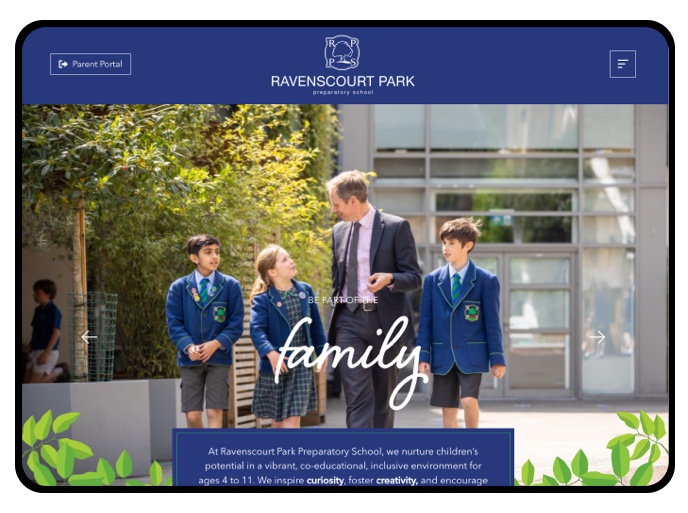
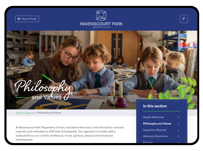
The marketing team were very keen for us to utilise hand written typography along with illustrations of leaves to speak to the lovely natural surroundings the school resides within. We paired these two elements together throughout the design of this site to create a really unique bespoke school website.
Great use of video and imagery on the homepage
Ravenscourt weren’t keen on having a video banner (like Port Regis) as it limits the amount of messages you can get across when a visitor immediately lands on your site. So, instead we advised a more traditional banner that utilises photo slides with the ability to include each of the school’s values within each slide.
We then included their video directly underneath the banner and animated this to grow in size as the user scrolls down the page. The video can then be unmuted easily so prospective parents can watch along if they want, or simply read along with the captions.

Clear calls to action
Like the other school websites we created, the internal pages on Ravenscourt include clear calls to action to encourage Open Day registrations, and each page finishes with a “Where to next?” section, prompting the user to explore other areas of the site.

Banners that clearly show faces
Many schools we speak to often complain that the banners on their website crop out pupil’s faces at various sizes and on various devices. The Ravenscourt site does a great job at ensuring this doesn’t happen, so their photography has the space to shine.
6. Hanford School Website *

Hanford is an independent all girls school based in a small village in Dorset. They came to us to revamp their school website around 8 years ago! During that time we’ve helped them add elements to freshen things up so we thought we’d include it in our list.
What makes this school website great?
What makes the Hanford site great, even though it’s 8 years old? Let’s take a look…
Engaging homepage video
Similar to the Port Regis example, the Hanford site uses an autoplaying background video in the header on the homepage to immediately give the visitor a sense of life at the school.
In contrast to Port Regis though, we made a conscious decision to NOT have the video fill the whole height of the users screen, but instead, only fill about 80% of it. This ensures users can still see content below the video, which encourages them to scroll down and explore the rest of the Hanford’s homepage content.

Clean and clear content pages
We love the clean layout for the internal pages on the Hanford site. Well-spaced typography and well used uppercase headings combined with lowercase subheadings make it easy to scan the content. The images that occupy the full width of the content, combined with images in columns give these internal pages an almost magazine / print like feel.

Great staff page
The Hanford site is our favourite when it comes to their staff page. Their photos really capture the personalities of each staff member, as each is taken in a different location around the grounds or in the school itself.
Once you click on a member of staff, they then have a short biography, which really helps parents get a feel for the staff their children will be working with.
We’d definitely recommend implementing something like this on your own school website.

Are you looking for an Education Web Design provider?
So that was our round up of (in our opinion) the 6 best school websites and specifically what features and functionality make them great.
We hope you found this useful and you found some solid takeaways for you to consider implementing on your own school website? If you are looking to speak with a education web design company who has experience in the education sector, then please do get in touch with us. We’d love to have a conversation and see if we can help you take back control of your school website with a fully bespoke design and the ability to easily manage all the content and imagery.